An exploration of how colour choice can impact on the experiences of patients, visitors and staff.
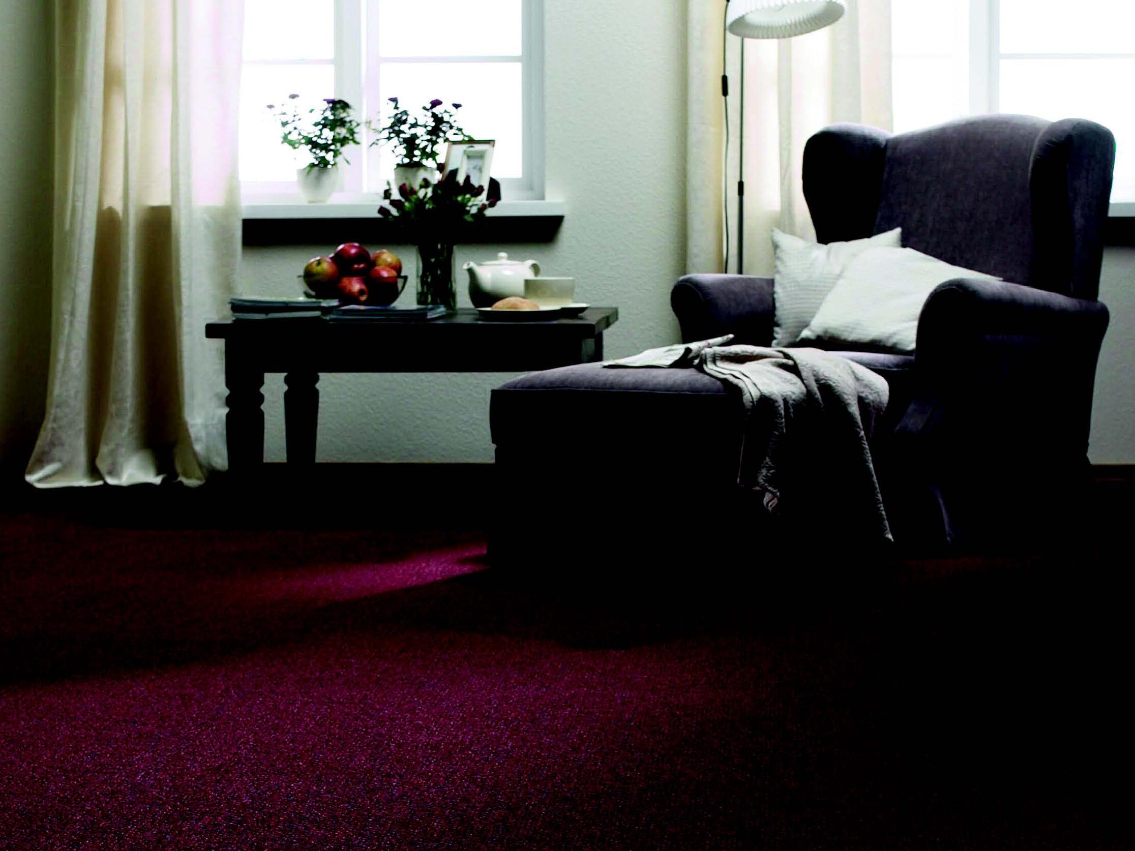
The use of colour in health and care settings such as hospitals and care homes, can significantly impact how relaxed staff, residents and patients feel.
Colour can even aid the healing process, with some hues having been found to help reduce blood pressure and anxiety. Others can boost the appetite (useful in eating disorder clinics and care homes), or reduce mental stimulation (think psychiatric units and dementia care facilities).
Paul Fleming, commercial market manager for Dulux Trade, said: “Colour can often be a secondary thought in the creation of new healthcare facilities. However, research has proven that when considered as part of a holistic design solution, it has the potential to significantly contribute to the wellbeing of both patients and staff.”
He added: “A healthcare colour scheme needs to consider firstly, people (patients, their families, staff); secondly, the purpose of each particular space.”
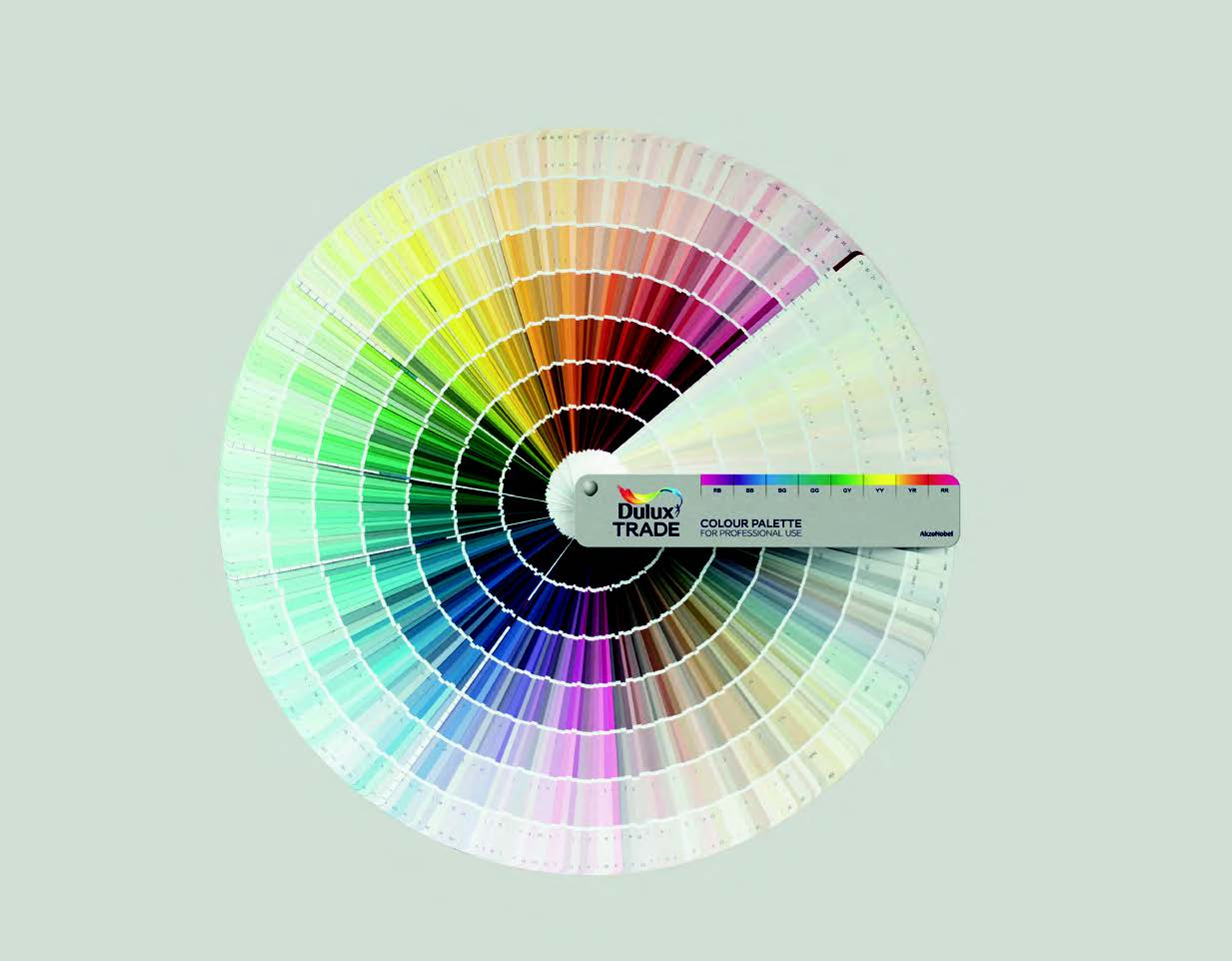
The P22 Healthcare Colour Palette
ProCure22 (P22) has supported Dulux parent company, AkzoNobel, and Tarkett in the creation of the P22 Healthcare Colour Palette. It has been developed to help architects and interior designers with all-important colour choices.
Cliff Jones, head of construction procurement at the Department of Health, said: “These two supply chain organisations have risen to the P22 challenge through the medium of evidence-based colour selection, de-mystifying an often-subjective selection process.
“It supports our designers to develop evidence-based and experience-grounded interior design proposals in collaboration with the building users. And it takes the personal bias out of colour selection” says Jones.
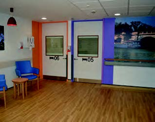
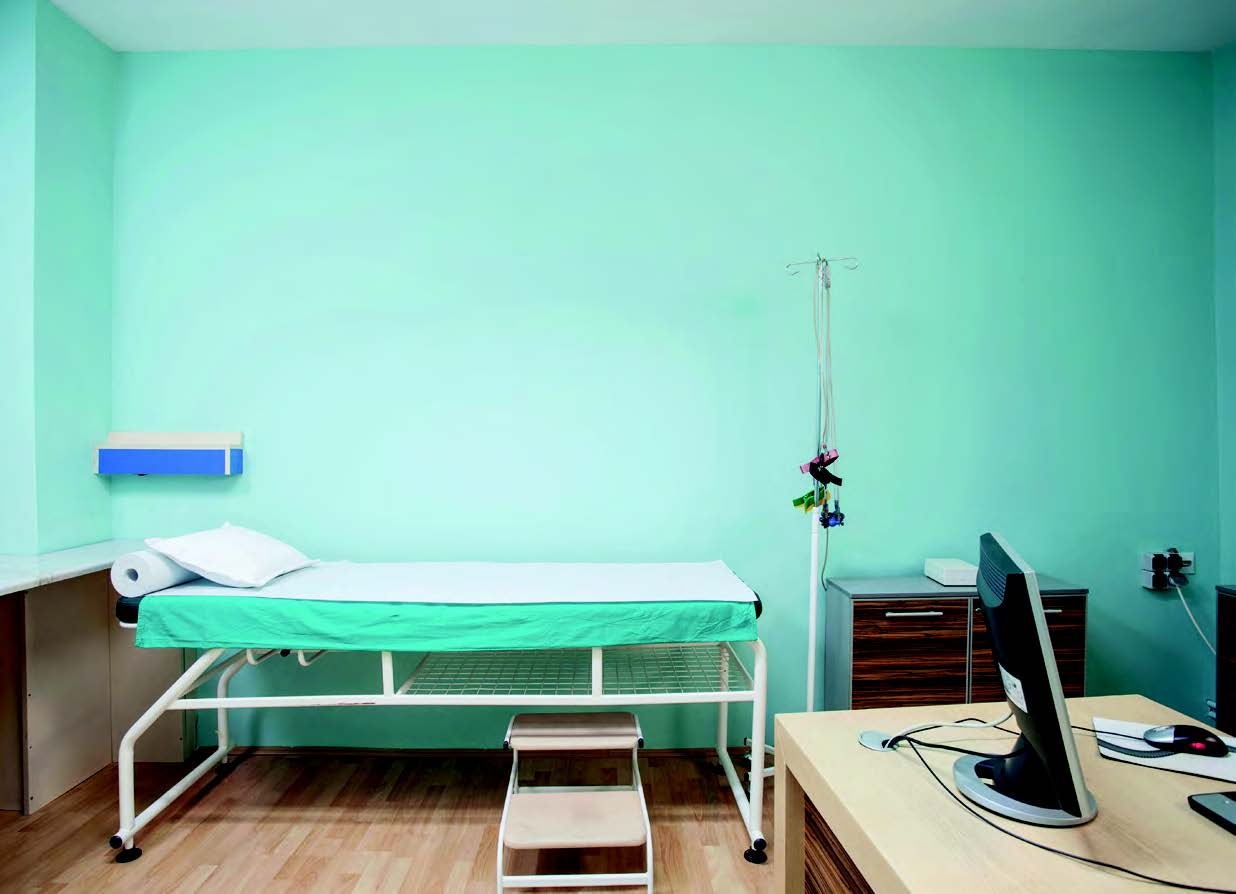
This selection tool is divided into specific rooms types including outpatient consult/exam rooms; urgent and emergency department rooms; and mental health inpatient bedrooms.
There are choices within pre-selected and matched floor/wall colour combinations.
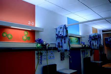
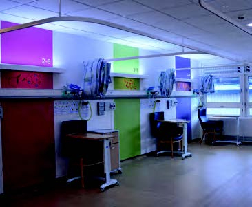
Each scheme has one main wall colour and three optional accent colours.
“It is generally accepted practice that the patient should benefit from the accent colour, either by viewing it when they are in bed or as a backdrop to the bed to aid identification”, said Jones.
Each scheme also has two flooring options.
Attention to detail in dementia areas
Colour choice is particularly important in specialist areas such as dementia care environments.
Lisa Tomlin, chief executive of flooring specialist, CFS, explains the importance of flooring colour in particular.
She said, “In a multi-level care home or dementia facility, with a single step between the kitchen and living area, using two different colours of carpet, preferably in a block colour, can help people to distinguish the step. Additionally, specifying a carpet that is a contrasting colour to furniture can help residents to find, or avoid, objects within the room.
“A contrast between the wall and floor design can reassure patients, making it clear where flooring boundaries are and reducing the risk of a trip or fall."
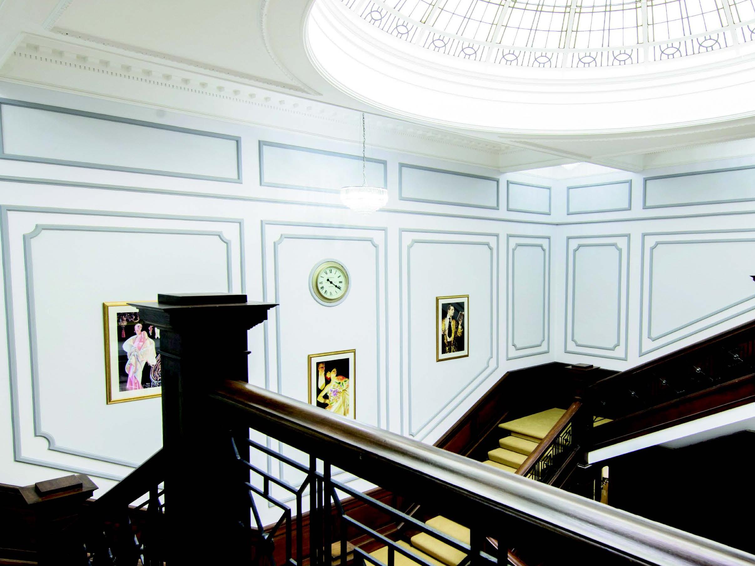
Case study – Kingston hospital
Johnstone’s Trade recently worked with Kingston Hospital NHS Foundation Trust and Hunters Architects to completely refurbish Derwent Ward, the hospital’s first purpose-designed dementia-friendly area.
The resulting design uses only six colours, chosen for their contrasting light-reflective values. It helps patients to navigate their way around the ward and to identify different rooms, bed spaces, and doorways.
Dulux recommendations
“We know that high-contrasting colour combinations can work well in an environment designed for dementia sufferers, especially on signage,” said Lisa Pilley, senior colour designer at Dulux Trade.
“However, this can all too often be pushed to the extreme and it is essential that colours stay within the boundaries of three different types of colour schemes” she added.
Furniture can be included here too. “Selecting furniture in a colour that contrasts with the walls and floors can help patients to recognise where they are within the premises,” said Pilley.
“Distinctive feature walls, especially opposite lifts and stairwells, can also be introduced to help patients identify which floor they are on and to find their room.
What to avoid
There are finishes that do have the potential to cause unnecessary anxiety and discomfort.
An example would be a dark-coloured rug positioned on a light-coloured floor – this could appear to people suffering with an increased level of confusion as a hole, subsequently causing them to feel less safe.
In summary
When used in the right place, in the right proportion, as part of a carefully-considered colour scheme, the majority of colours can be effective within a healthcare environment, especially in specialist areas like dementia facilities.
But, while there are a variety of resources regarding the needs of individuals living with dementia; currently there is no set legislation, and the available research only provides best-practice guidelines.