Finding your way around an unfamiliar setting is hard enough, but especially challenging when you are living with dementia as the disease often results in a decline in navigation skills and increased confusion.
Research carried out by Bournemouth University’s psychology department, led my Mary O’Malley, was published in 2017 and explored how people with dementia learn to navigate unfamiliar environments and what consequences this could have for dementia care home building and design guidelines. And her five years of research, in conjunction with the university’s Ageing and Dementia Centre, resulted in the creation of ‘dementia friendly’ design recommendations which are widely used by architects, building standards agencies, care commissioning bodies, and healthcare practitioners.
CHANGING PERCEPTIONS
She said: “By changing people’s perceptions of what dementia is, this will create a more-user-friendly and accessible environment that will not only benefit those with dementia, but will benefit the community as a whole.” Key to dementia-friendly wayfinding strategies, she advises, is clear layouts and interior finishes. The report states: “Repetitive layouts within a care home setting, such as similar pictures along the corridors, a lack of memorable spaces, and limited colour contrast in carpets, can make it hard for people with dementia to learn and memorise new routes. And these can impact on every day, simple tasks such as going to a communal lounge.” Other recommendations include:
BACK TO NATURE
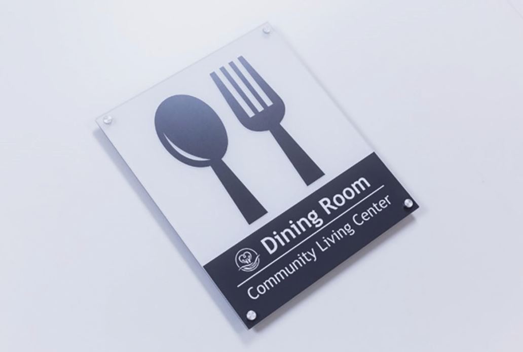
Imagery that references the local community and nature have been found to have the most impact. Large letters and numbers help people to easily identify the level and area, while pairing familiar icons alongside text will reinforce legibility and wayfinding, such as a knife and fork on the sign for the dining area. And it advises using ‘clear, plain language, such as ‘eye clinic’ instead of ‘ophthalmology’. Other tips include using crisp Sans Serif lettering contrasting with the background colour; bright, bold and vivid colours; creating neighbourhoods or zones with distinct names, colours, icons, and imagery; and, most importantly, ensuring wayfinding strategies are consistent across a site. A spokesman for Creative said: “The hospital experience, in particular, can be disorientating for any new visitor, but for someone with dementia, this stress can be magnified tenfold. “Increased agitation and distress are common responses to the struggle of navigating the unfamiliar hospital terrain and the perpetual and visuospatial problems faced by those with dementia, such as difficulty with depth perception, heighten this sense of disorientation and increase the risk of injury.
REDUCING CONFUSION
“While there may be no cure for dementia, there are notable ways that healthcare architects, designers, and facilities managers can create an environment that better supports the wellbeing and safety of patients and visitors with the disease.” The world-renowned Dementia Services Development Centre (DSDC) at the University of Stirling adds: “People with dementia need to work constantly to make sense of their surroundings, so avoid Trompe-l’oeil effects, two-dimensional scenes that mimic three-dimensional environments, usually rendered in a realistic way and large scale, for example forest scenes or wallpaper bookcases. “False scenes like these can add to
confusion and disorientation, thereby increasing anxiety and potentiallydistressed
behaviour. “Signs should be legible and use recognisable symbols or pictograms and colour and tonal contrast (Light Reflectance Values) should be considered in relation to the context of the sign. “Font sizes should be appropriately sized depending on from what distance the signs will be read, ie; longer distances will require larger font sizes.” Crucially, it also states that all wayfinding signs should be positioned at a height of 1.2m from the floor plane to the base of the sign – the ideal ergonomic height for older people with a slightly-stooped gaze.

THE ART OF WAYFINDING
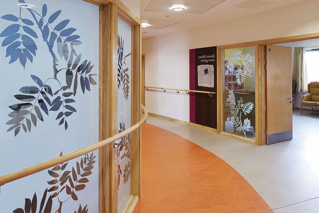
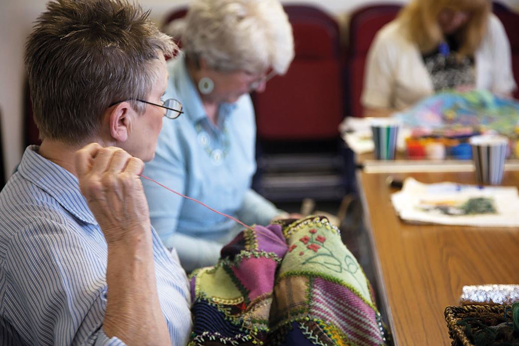
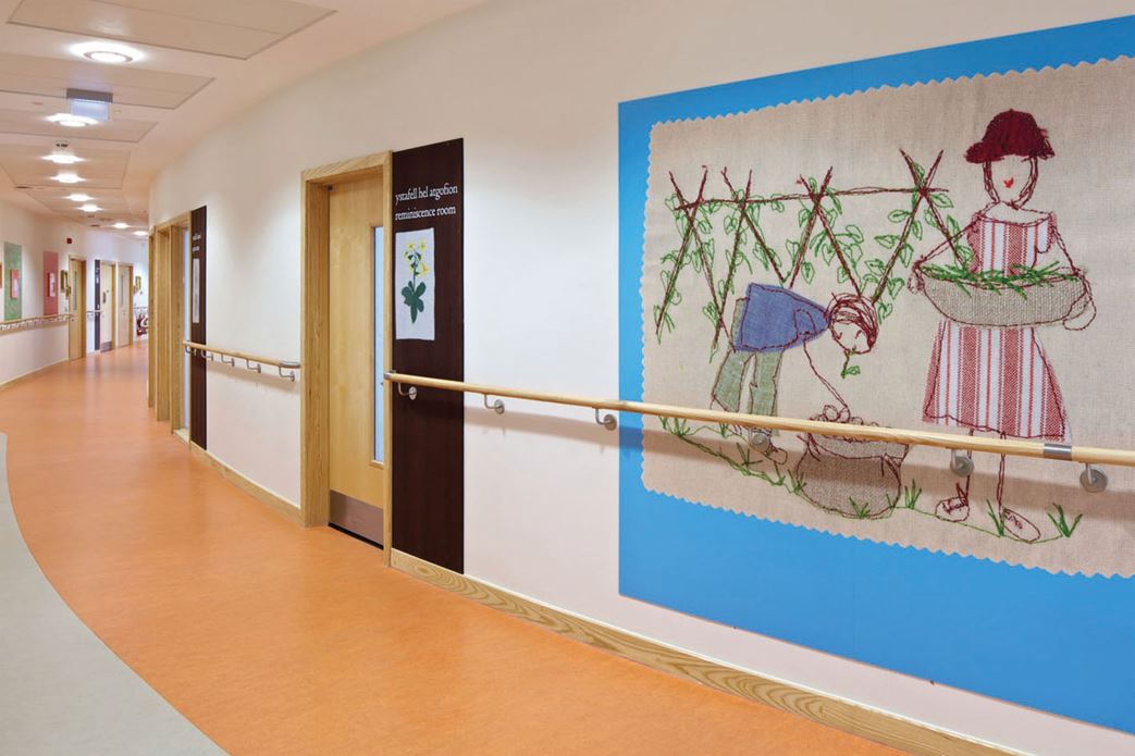
As mentioned in many of the research documents, artwork has a key role to play in dementia-friendly wayfinding solutions. And Art in Site is increasingly using textural artwork to enhance wayfinding in health and social care settings – as Alzheimer’s and other forms of dementia can lead to a heightened sensory attraction to texture and colour. At the Cefyn Coed Dementia Unit in Swansea, the Art in Site team commissioned local artist, Alison Moger, to produce a series of embroidered artworks based on her memories of Swansea growing up as a child. She also produced designed by natural leaf shapes which appear in various shapes, colours and textures in windows,
doors, and walls throughout the facility. Art in Site director, Louisa Williams, said: “Throughout the space, we placed Alison’s work strategically in order to assist navigation and orientation, for example as totems on doors. “And our use of picture-based wayfinding has proved helpful to the user group, given the loss of written language comprehension in many people with Alzheimer’s.”
PLAYING ON MEMORIES
She added: “For the wayfinding we reinterpreted the conventional dementia signs of bed, toilet, plate with knife and fork, seat etc in embroidery, using Alison’s vintage fabrics and whimsical style. “This time we printed onto a wood veneer, to provide a different texture and value and we believe these embroidered signposts promote and reflect human dignity, warmth, and gentleness.” And, at Hillingdon Hospital’s Beaconsfield Older Person’s Assessment Unit, Art in Site brought in Angela A’Court to produce large pastel artworks each depicting familiar objects and confined to a specific colour palette to lodge more firmly on the memories of people with dementia. “People with dementia often find it easier to navigate using pictures, and so we placed images of domestic objects in vibrant colours near the bedside, in order to allow people to find their way ‘home’ more easily,” said Williams.

